Changelog - November - Part 1: Site-wide makeover

Landing page re-design
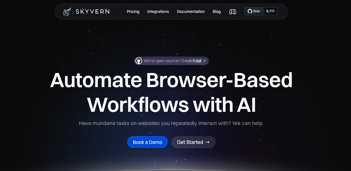
We just released our new landing page at https://www.skyvern.com
Our old one desperately needed a makeover. It was something I cooked up two nights before a launch.
Even though it looked scrappy, it served its purpose well.
Our potential customers were able to go to it and see what Skyvern could do. They would see use-cases, they'd be able to book a demo, they'd be able to try our product out, they'd be able to navigate to our open source repo
There are a few places where it really fell short:
1. I built it in Webflow, and it was becoming challenging to make non-trivial updates to it
2. All of the images were AI generated, and some poorly at that. They didn't have any intrinsic visual appeal (and sometimes I felt like it hurt more than it helped)
3. We wanted to migrate to Framer and were looking for an excuse to invest the time -- turns out prepping for a Hackernews launch is the way to do it
4. We wanted to add some testimonials to our website
5. We wanted to highlight that we were open source!
So.. here we are. New launch. New landing page.
I'd love to hear what you think! Anything we could improve?

Skyvern Logged-in page re-design
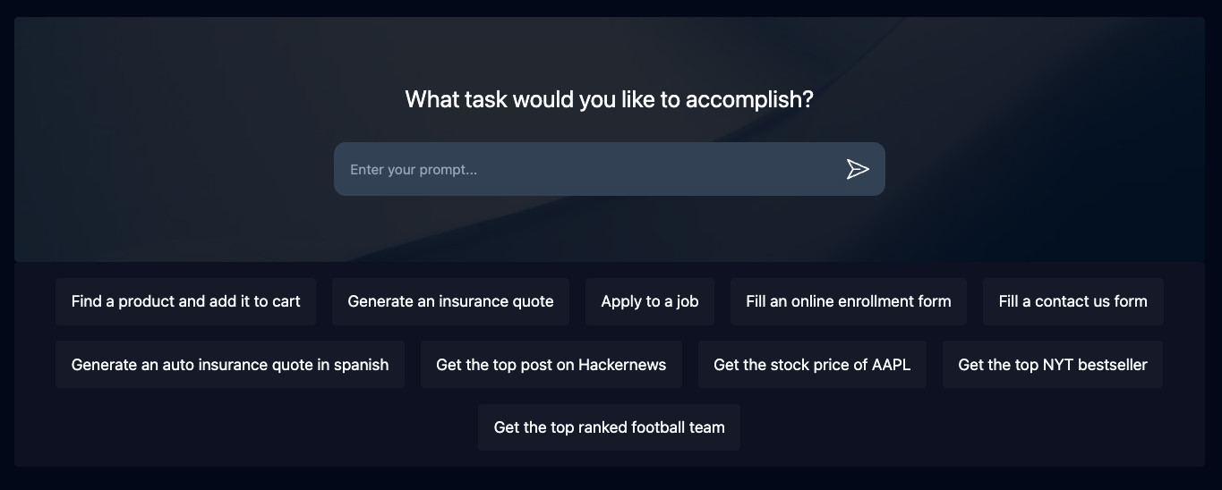
We just re-did our logged-in page
This is one of the things I love about software. You can ship a V0, knowing that you can come back and update it and make it better in the future
What do you guys think of the design?

Task Page re-design
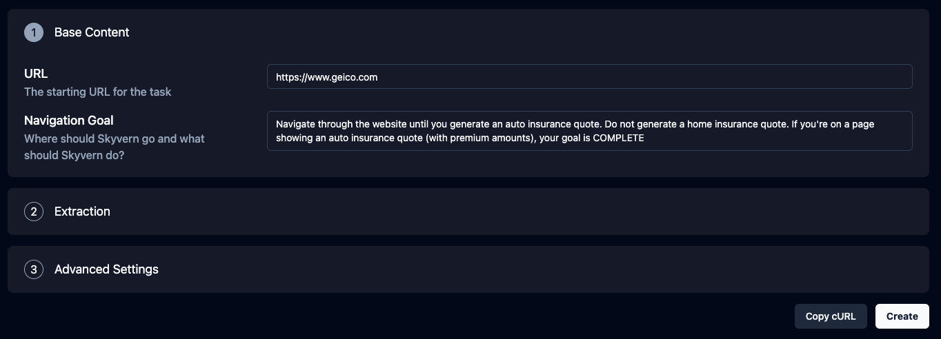
The old one looked and felt like an MVP.. because it was one :)
It had a few major issues:
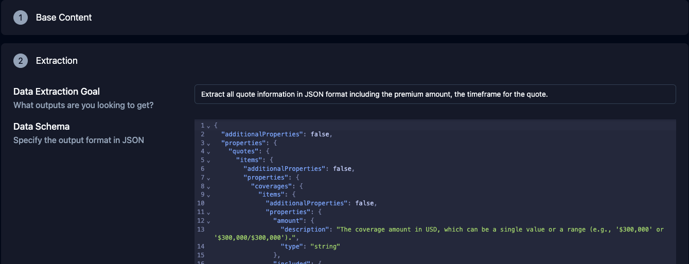
- It didn't segment the sections correctly, overwhelming the user
- It didn't have adequate help text, forcing our users to carry a higher mental burden understanding how to use Skyvern
- The field formatting itself feels more crisp now, increasing the perceived quality of the product


